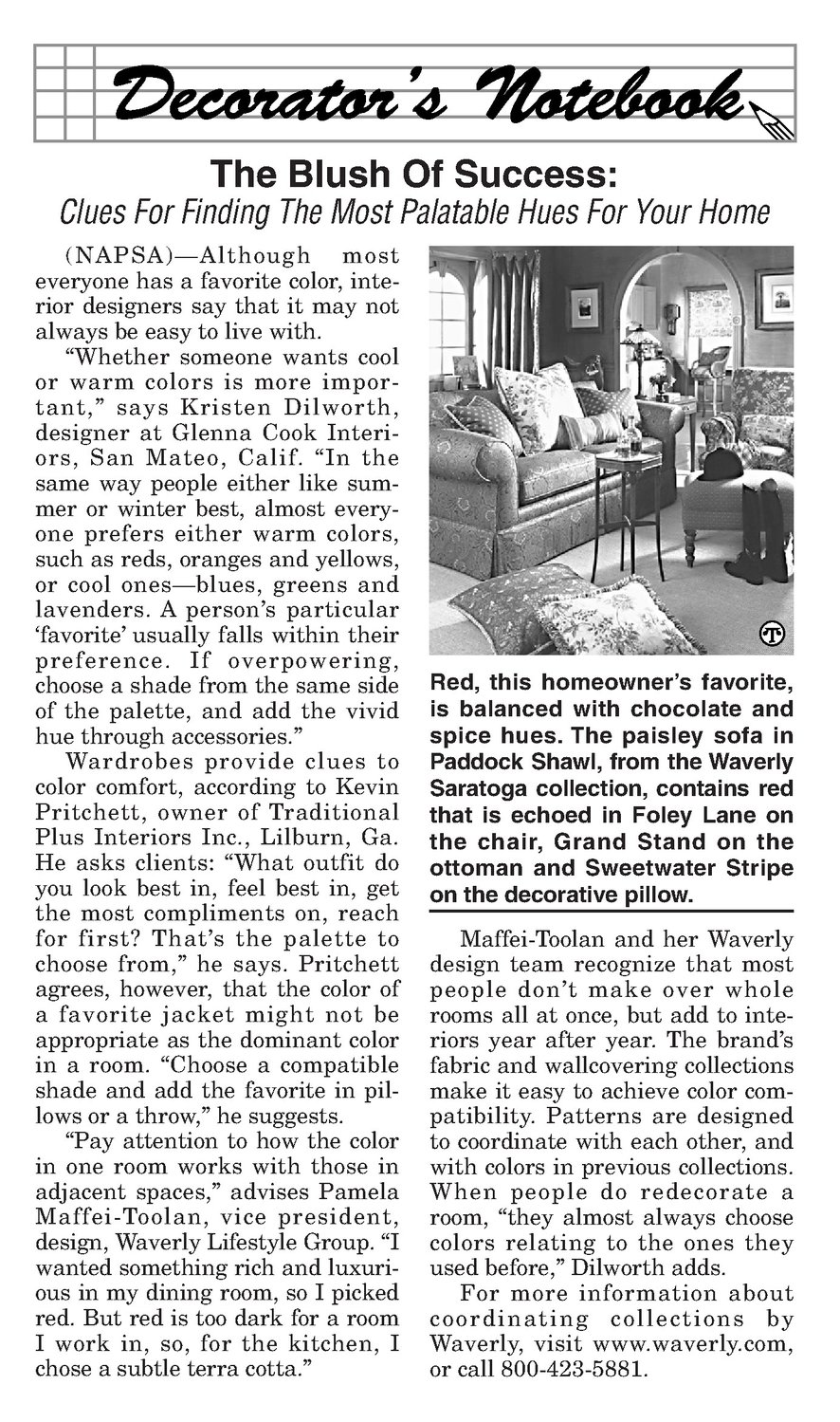


Clues For Finding The Most Palatable Hues For Your Home (NAPSA)—Although most everyone has a favorite color, interior designers say that it may not always be easy to live with. “Whether someone wants cool or warm colors is more important,” says Kristen Dilworth, designer at Glenna Cook Interiors, San Mateo, Calif. “In the same way people either like summer or winter best, almost everyone prefers either warm colors, such as reds, oranges and yellows, or cool ones—blues, greens and lavenders. A person’s particular ‘favorite’ usually falls within their preference. If overpowering, choose a shade from the sameside of the palette, and add the vivid hue through accessories.” Wardrobes provide clues to color comfort, according to Kevin Pritchett, owner of Traditional Plus Interiors Inc., Lilburn, Ga. He asks clients: “What outfit do you look best in, feel best in, get the most compliments on, reach for first? That’s the palette to choose from,” he says. Pritchett agrees, however, that the color of a favorite jacket might not be appropriate as the dominantcolor in a room. “Choose a compatible shade and add the favorite in pillowsor a throw,” he suggests. “Pay attention to how the color in one room works with those in adjacent spaces,” advises Pamela Maffei-Toolan, vice president, design, Waverly Lifestyle Group. “I wanted something rich and luxurious in my dining room, so I picked red. But red is too dark for a room I work in, so, for the kitchen, I chose a subtle terra cotta.” Red, this homeowner’s favorite, is balanced with chocolate and spice hues. The paisley sofa in Paddock Shawl, from the Waverly Saratoga collection, contains red that is echoed in Foley Lane on the chair, Grand Stand on the ottoman and Sweetwater Stripe on the decorative pillow. Maffei-Toolan and her Waverly design team recognize that most people don’t make over whole roomsall at once, but add to interiors year after year. The brand’s fabric and wallcovering collections make it easy to achieve color compatibility. Patterns are designed to coordinate with each other, and with colors in previous collections. When people do redecorate a room, “they almost always choose colors relating to the ones they used before,” Dilworth adds. For more information about coordinating collections by Waverly, visit www.waverly.com, or call 800-423-5881.